
Apple is experimenting with a new HTML form control?
Hidde de Vries just posted on this Linkedin
Apple is experimenting with a new HTML form control: A switch (not in spec just yet). It is designed as an attribute for “<input type=checkbox>”.
You’d turn a checkbox into a switch by adding the “switch” attribute…
Apple is specifying ways to reference the parts of the switch, ie the thumb bit, the surround, the shadows etc.
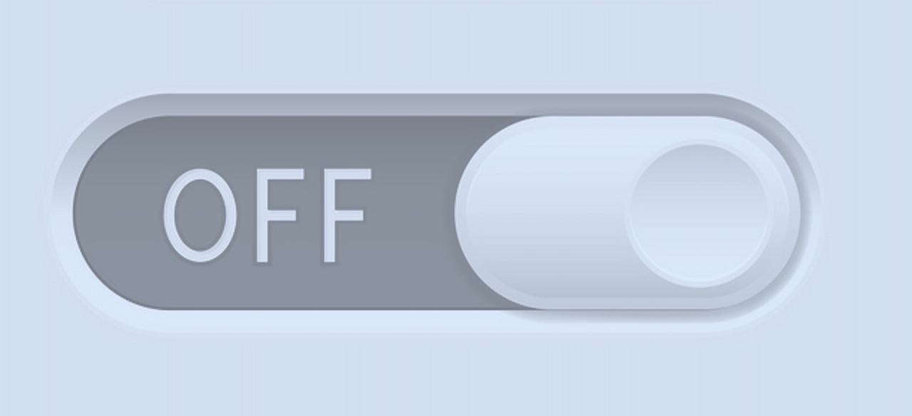
Personally, I’ve always found slider switches a little confusing (think about the last ‘choose cookies’ modal you responded to).
No matter how clever the visual elements (like textures, colours, shadows etc.) applied to the widget, it’s very often unclear if the switch is “on” or “off” position. I think part of this stems from the wish to create a skeuomorphic switch. After all, a nice recessed slider can have a nice feel in the hand, so why not capture some of that on your mobile screen?
Except that’s not right either. I’m guessing industrial designers created the recessed slider toggle as an improvement on the classic toggle switch. There have been a few variations on toggles, but one thing has remained constant both in UI and real-world: The toggles don’t work without labels
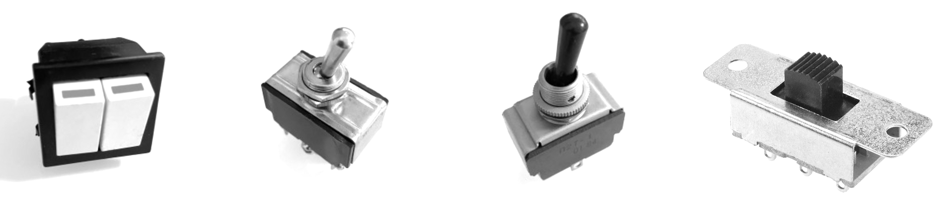
Take a look at the first switch in the row. You probably have some of these in your kitchen. I think the original concept was that when the switch is turned “on”, the circuit is live so the device indicates that with a bit of red showing on the edge of the toggle. In theory a great idea, but I’ve lost count of how many old installations I’ve worked on where it wasn’t clear if the “warning” was “attention, circuit disabled!” or “circuit live!”.
Long story short, not only do toggles not work without labels, CHECKBOXES DON’T NEED LABELS to convey their state, regardless of user agent or styling.
So back to Apple’s proposal:-)
If Apple thinks we need to express the “on” or “off” state of a page or application component, how might we do it without introducing a new element? Here’s a standard html checkbox with a bit of CSS attached:
Well, yes, it’s ugly, I’m not a UI expert, but it does clearly show the two required states without the need for introducing a new element (here’s an approach to making a toggle on w3schools).
Note that you can add all the CSS bells and whistles you want (word colour, bold text etc.) but that the central meaning is conveyed by the checkbox control itself. If you use assistive tech to use this page you should be able to know what the status of the checkbox is WITHOUT and visual aids.
Also, this has me wondering. Now that everyone is so keen to break HTML’s mental model of the page, how are users expected to understand a permanent thing like a switch? In single-page-apps or React-driven things (or Linkedin itself) the page is impermanent to the point of rendering bookmarks useless. For that matter, the ‘back’ button is compromised as well. You remembered something seen just now on the previous page? Click back, and nope, it’s gone:-(
I think we need to be careful of messing up the internet more that we already have…
In
W3C
What do you think?