
- Answered the why Unveiled the hidden problem affecting operator usage of the client’s investment.
- Innovative redesign Revamped the adviser desktop for enhanced usability, introducing responsive behaviour and impactful metric summarization.
- Optimized performance Intuitive dashboard design helped improve customer effort score (CES) and first-call resolution over the first six months.
The challenge
Address why the client’s significant investment in the customer care accelerator didn’t reduce the team’s average call-handling time. Optimize its performance without discarding the existing system.
My role
UX Architect leading discovery and ideation workshops, advising on the digital application creation process, and redirecting project governance.
How I did it
Uncovered a pivotal insight through user research and operator shadowing, redesigned dashboard behaviour and visual presentation, and guided changes in project governance.
The project in a bit more detail
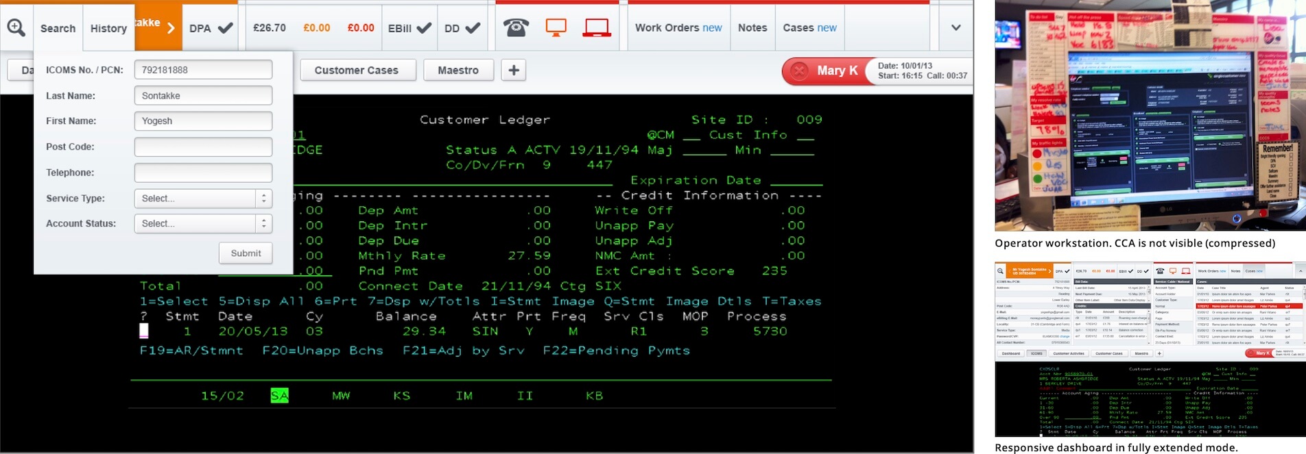
The client had invested heavily in a customised version of Microsoft’s “customer care accelerator”, a tool to show call-centre operators information from many sources in one place. They were unhappy with the performance, the challenge from the customer was “why hasn’t my investment in CCA reduced my team’s average call-handling time? Any solution we designed would have to leverage the existing investment in dashboard software customisation and ensure scalability and a high level of adoption by operators. I had shadowed call-centre operators many times before and always found game-changing insights by simply listening in with my ears open. It was no different at this customer.
Redesign the dashboard to replace show/hide behaviour with responsive behaviour. Find innovative ways to summarise business metrics in a single row of controls
My delivery
I consulted on the customer’s digital application creation process, helping avoid recreating the same problem in future services. I suggested changes to their project governance so for example, BAs at this company had never challenged business stakeholder requirements.
I acted as UX Architect, working onsite with the customer and leading discovery and ideation workshops. As had happened so many times before, my user research led to the discovery of a defining insight: It turned out that 80% of operators used the software in such a way as to hide the dashboard. In other words, no-one was even using the thing that the customer had already spent a large budget developing.
I redesigned the dashboard tool to replace show/hide behaviour with responsive behaviour.
I proposed innovative ways to summarise business metrics in a single row of controls enabling better usability and flexibility.
Activities
- Stakeholder management
- User research
- Contextual analysis
- Day in the life study
- Shadow call-centre operators
- UX concept
- Wireframe specification
- Art direction
Can I help you solve a similar problem? dug@goodlookslikethis.com