
Looking for the best blueprint
I've been helping teams create blueprints for many years now and have picked up on a couple of themes. This means there probably isn't one 'ideal' form of the service blueprint, but there are definitely things to keep in mind while creating them.
Some thoughts on what ‘best in class’ might actually mean…
Example 1 - Blueprints created by a team during a 2-day off-site.
What makes it work:
- They did it together
- They built it based on problem space observations mixed with principles
Why is it good:
- It uncovered the shape of possible solutions to improve performance
- It created a consensus around the problem/solution
- It was a fun, team-building activity
The process the team went through:
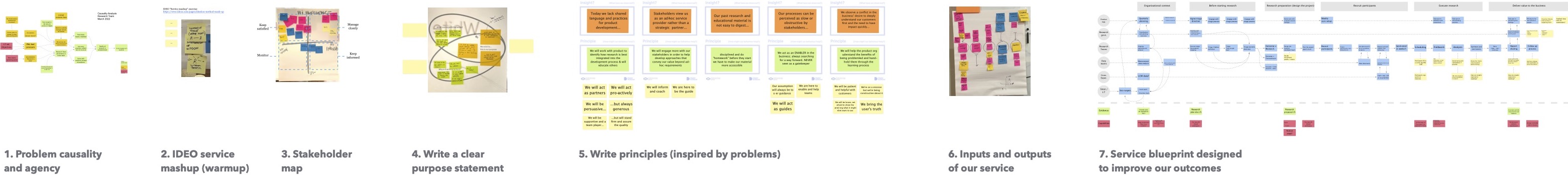
The ‘rough and ready’ blueprint:
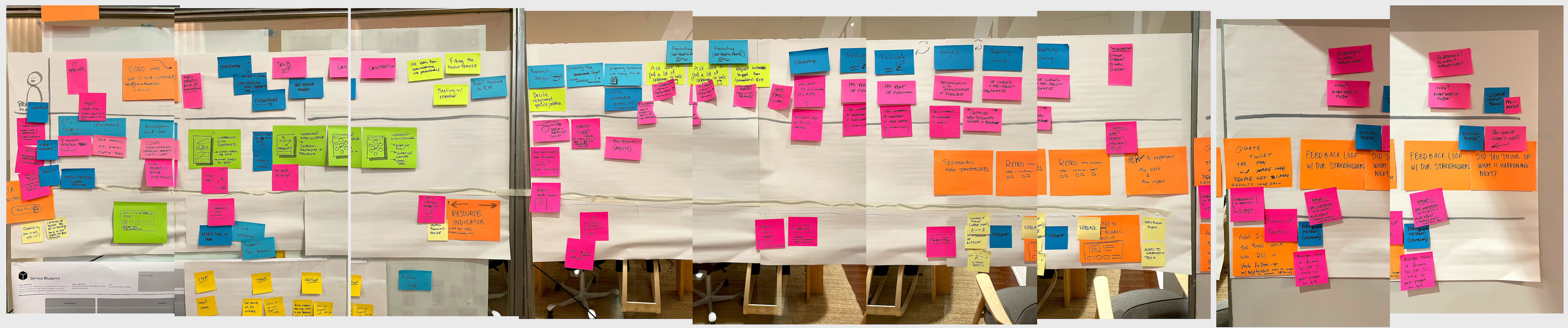
As you can see, it looks nasty, but was very effective.
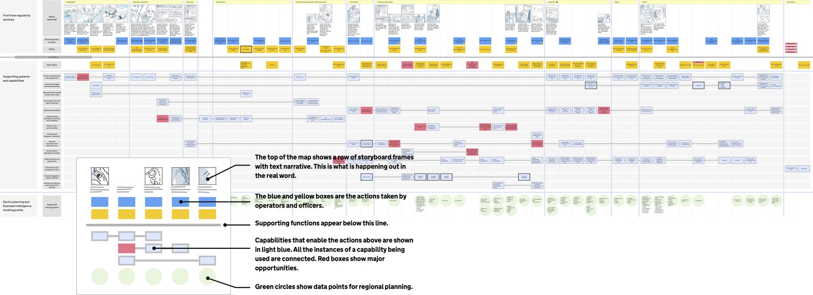
Example 2 - Blueprints with a thematic ‘lens’ (data accuracy in this example)
The blueprint (note RAG in bottom row):
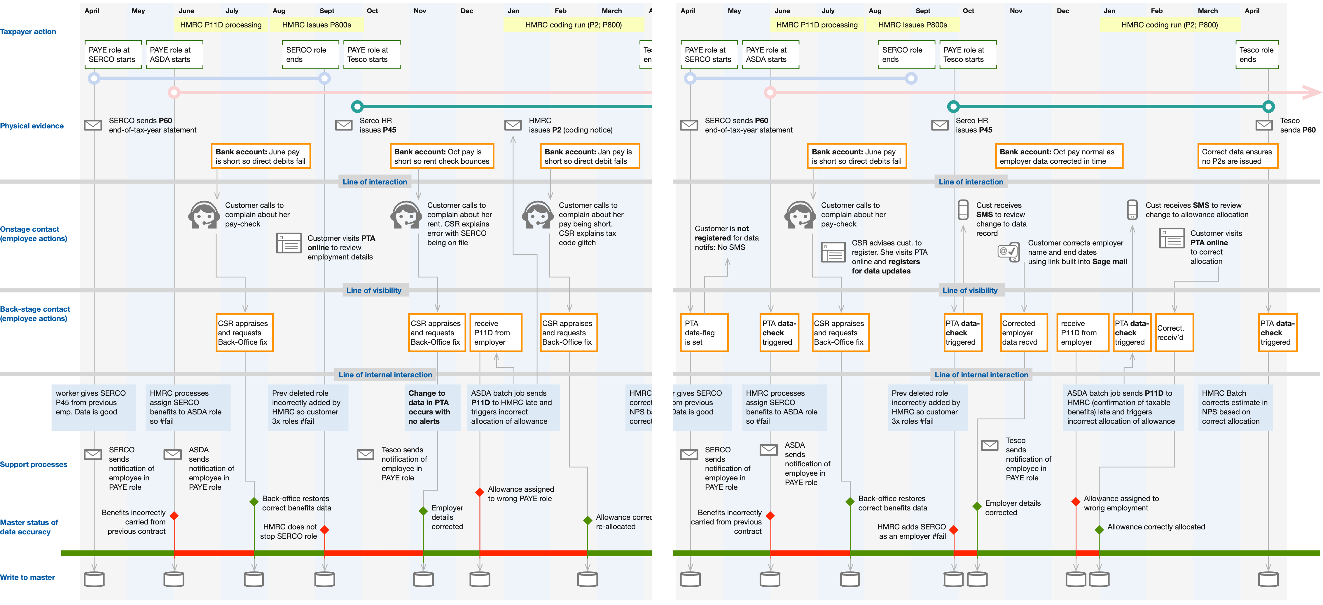
What makes it good:
The ‘lens’ (data accuracy) allows the problem space to be measured. In this blueprint, the bottom row shows data accuracy. When red, the end-customer’s data is incorrect. When green, the data is accurate. In the case of this service (PAYE tax collection) when the data is broken, really bad things happen to people. This tool helped motivate HMRC teams to improve.
Most transformation briefs will have one or more useful lenses you could apply to your blueprint (time-to-complete; account status; number of calls; number of pots; etc.)
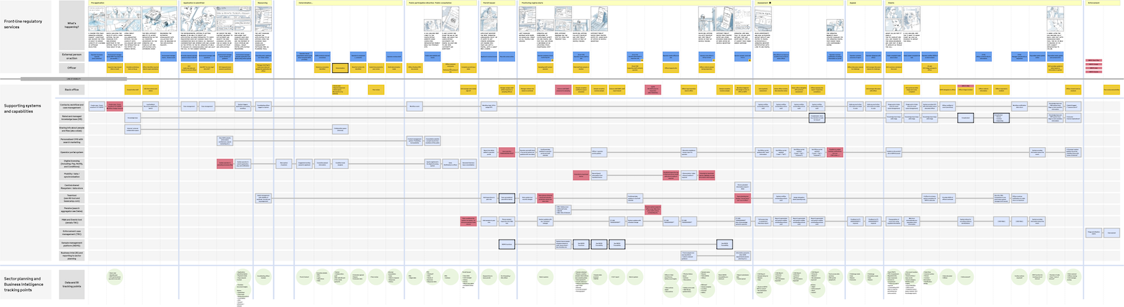
Example 3 - Blueprints that show capability overlaps along the customer journey
What makes it good:
This org was made up of 5 separate business units, but by blueprinting together, they identified overlaps and common capabilities. This resulted in better performance and review or workflows.
The blueprint (note connected capabilities in lower rows):
In this case, another tool - the tube map - allowed the design team to share and get worker feedback about the structure and connections between organisational silos:
See above: The tube map (posted in all company canteens to get candid feedback from colleagues).
In
Design
What do you think?