

Background
I was tasked with creating a concept for Vodafone Group that the mobile operator could use to fuel its race to electronic self-care on the mobile platform and deploy to local markets.
The customer had already developed useful market and customer insights: A high percentage of call-centre volume globally was down to misunderstanding bill content, disagreeing with bill content or other billing query. Also, an important insight was that there was a spike in service requests during the first 90 days of the customer lifecycle.
The key insight here was customers were forever getting bills they didn’t expect and they didn’t like the BT model of having to purchase an extra package to save money.
In our proposed concept, the bill is visualised in a two-way feedback system which allows the problem to be fixed by dragging the circle with a gesture and the appropriate back-office adjustments (change of package, supplement etc.) happen in the background.
What I did
I proposed two ideas in the planning brief.
just because everyone is using data visualisation doesn’t mean that customers understand it.
The first was that just because everyone is using data visualisation doesn’t mean that customers understand it. I got the team to work on defining the precise meaning conveyed by the graphics as components went from the “out of focus” to “focus” states in order to remove as much information as possible.
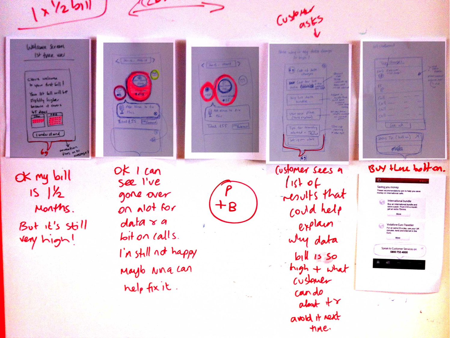
The second, that people hate their mobile operator because they never pre-empt problems. Why should we make a fancy UI to describe a problem when we could use the same UI to fix the problem (as avoiding the problem in the first place wasn’t realistic) in a way that hid the billing complexities from the customer and just let them know when things were OK.
Why should we make a fancy UI to describe a problem when we could use the same UI to fix the problem?
Outcomes
I was able to convert these customer insights into user needs and proposed experiences that solved these problems while reinforcing the core brand message of “power to you”.
On this project I was the experience lead, setting the strategy, writing the brief, joining in sketching and guiding delivery.
Can I help you solve a similar problem? dug@goodlookslikethis.com